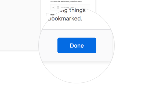
Buttons
Buttons execute an action or change the state of an application. Button text helps users understand what action will occur when they click or tap.
Usage

Buttons make actions visible. They enable users to change or complete a task. For example use a button to let users confirm a change. Use links in favor of buttons for navigation purposes with the exception of the back and forward button.
Types
Primary
Primary buttons draw attention to a specific action. Try to limit one primary button per view.
Default
Default buttons are used for secondary actions when combined with a primary button or when you need to list multiple actions in one single view like a preference page.
Ghost
Ghost buttons include an icon with no accompanying text.
If there isn’t enough cue that the button is actionable add a background like the default button.
Styles
Colors
Primary
Text: White #ffffff
Background: Blue 60 #0060df
Default
Text: Grey 90 #0c0c0d
Background: Grey 90 a10 rgba(12, 12, 13, 0.1)
Ghost
Icon: Grey 90 a80 rgba(12, 12, 13, 0.8)
Background: Transparent
Sizes
Micro
Corner Radius: 2px
Height: 24px
Horizontal Padding: 8px
Text: 11px, regular 400
Width: Auto
Use the micro version when you need to display two different primary actions with different levels of importance. Or when you don’t have enough real estate. For example in Firefox Accounts “Skip This Step” has a lower importance compared to “Sign in.”
Default
Corner Radius: 2px
Height: 32px
Horizontal Padding: 8px
Text: 13px, regular 400
Minimum Width*: 132px
Width: Auto
Height: 32px
Padding: 8px
Icon Size: 16px
Width: 32px
Pages like Firefox error pages feature the default size button. When you need a call to action give the default size a higher priority. When the real estate is not enough opt for the micro version. When you need a more prominent action opt for the puffy version.
Puffy
Corner Radius: 4px
Height: 48px
Horizontal Padding: 16px
Text: 15px, regular 400
Width: Auto
Use the puffy version when you display a call to action in large components or views. Bigger space, bigger targets. For example the modal of Firefox onboarding.
Behaviours
Primary
Default Background: Blue 60 #0060df
Hover Background: Blue 70 #003eaa
Pressed Background: Blue 80 #002275
Focus: box-shadow: 0 0 0 1px #0a84ff inset, 0 0 0 1px
#0a84ff, 0 0 0 4px rgba(10, 132, 255, 0.3)
Disabled: 40% Opacity
Default
Default Background: Grey 90 a10 rgba(12, 12, 13, 0.1)
Hover Background: Grey 90 a20 rgba(12, 12, 13, 0.2)
Pressed Background: Grey 90 a30 rgba(12, 12, 13, 0.3)
Focus: box-shadow: 0 0 0 1px #0a84ff inset, 0 0 0 1px #0a84ff, 0 0 0 4px rgba(10, 132, 255, 0.3)
Disabled: 40% Opacity
Ghost
Default Background: Transparent
Hover Background: Grey 90 a10 rgba(12, 12, 13, 0.1)
Pressed Background: Grey 90 a20 rgba(12, 12, 13, 0.2)
Focus: box-shadow: 0 0 0 1px #0a84ff inset, 0 0 0 1px #0a84ff, 0 0 0 4px rgba(10, 132, 255, 0.3)
Disabled: 40% Opacity
Copy Rules
-
When possible, use labels that describe the action or result of selecting the button. Use the same terms to describe the action in both the button and any supporting instructional copy.
-
When using two buttons to present a binary choice, if possible label as “X” and “Don’t X”. This will also help with localization.
-
Use ellipses in buttons when the action requires additional user input, usually via a dialog, an alert or moving the operation to another window or part of the UI.


