Input Fields
Input fields allow users to add text within a defined area.
Usage
Use input fields when requiring users to enter text (like email address, account name, search keyword, etc.) that can’t be automatically generated or displayed.
Styles
The following specs are designed for desktop and web. Mobile UIs follow their platform guidelines. See Material Design Guidelines for Android and Apple’s Human Interface Guideline for iOS.
Size
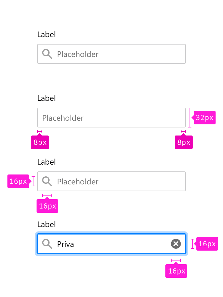
Label margin bottom: 8px
Corner radius: 2px
Padding horizontal: 8px
Width: auto
Height: 32px
Color
Label: Grey 90 #0c0c0d
Border: Grey 90 a20 rgba(12, 12, 13, 0.2)
Placeholder: Grey 50 #737373
Typography
Label: 0.833rem/1.4
Placeholder: 0.833rem/1.4
Icons
Icon width: 16px
Icon height: 16px
Placeholder icon: Grey 90 a40 rgba(12, 12, 13, 0.4)
Action icon: Grey 90 a60 rgba(12, 12, 13, 0.6)
Behaviors
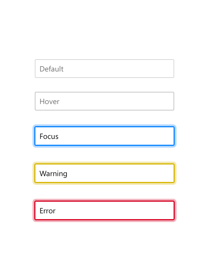
Default
Border color: Grey 90 a20 rgba(12, 12, 13, 0.2)
Hover
Border color: Grey 90 a30 rgba(12, 12, 13, 0.3)
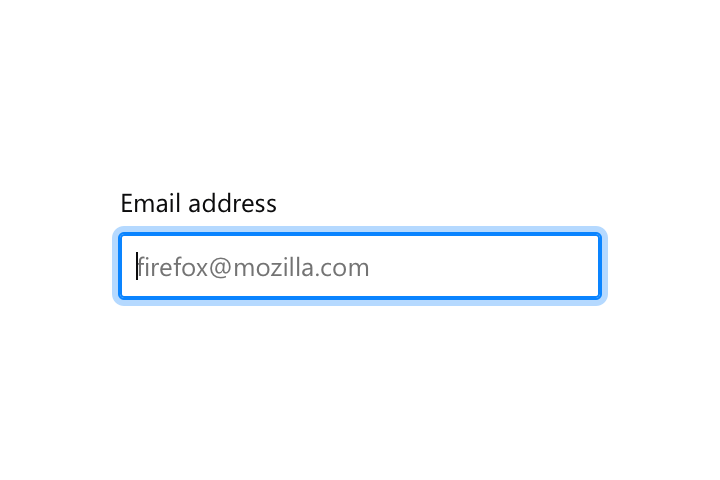
Focus
Border color: Blue 50 #0a84ff
Box shadow: 0 0 0 1px #0a84ff, 0 0 0 4px rgba(10, 132, 255, 0.3)
Warning
Border color: Yellow 60 #d7b600
Box shadow: 0 0 0 1px #d7b600, 0 0 0 4px rgba(215, 182, 0, 0.3)
Error
Border color: Red 60 #d70022
Box shadow: 0 0 0 1px #d70022, 0 0 0 4px rgba(251, 0, 34, 0.3)
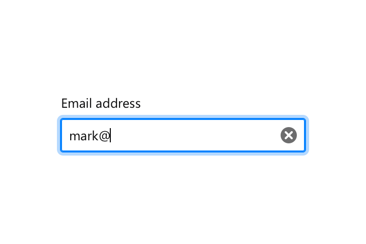
In text fields, when a user starts typing display a clear text field icon on the opposite side of the field.
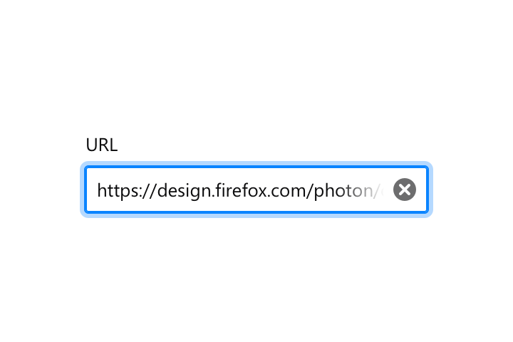
In input fields, when the text overflows outside the field add a linear gradient to indicate to users that something is hidden.
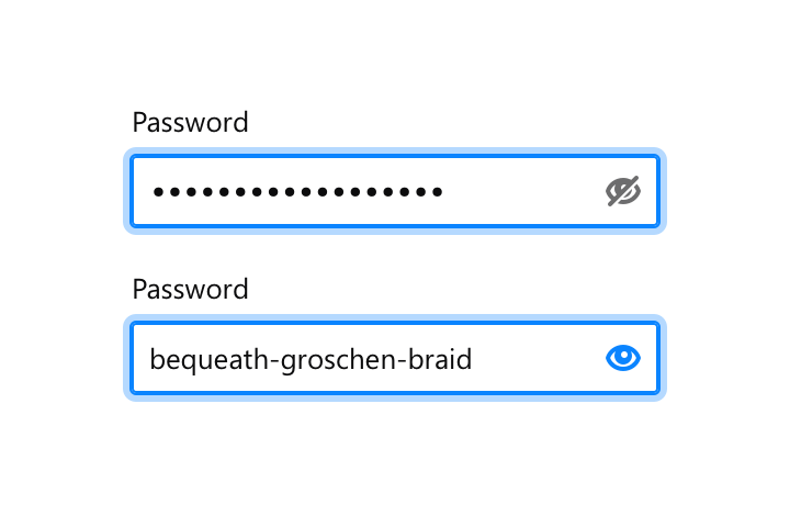
In password fields, when a user starts typing display a password show icon and password hide icon on press.
Copy Rules
Input Fields Messages
-
Prioritize brevity over niceties. Don’t say please. Just tell people what to do. “Choose a number that is less than…”
-
Be as specific as possible in the message. “Choose a date” or “Choose a time” or “Enter an address” are all better than “Enter a value.”
-
Speak to users’ cognitive processes instead of their tactile ones where possible. Use words like “choose” or “select” instead of “type” or “key”. We’d rather engage users’ minds than their hands, and this also speaks more universally to users accessing the Web with touchscreens, speech-recognition software, or other user input devices.
-
If there are programmatic rules governing valid choices, expose these in the messages where possible. Don’t just tell someone that X is the nearest valid value, tell them that they must choose values in x increments. “Choose times in 30-minute increments from 8:00 am.”
Input Fields Placeholders
- Tell users what objects are going to be searched if possible. “Search + object” is more clear than just saying “Search”.