Toolbars
 This is a working draft
Report issue
This is a working draft
Report issue
Toolbars group buttons and controls together in a horizontal line spanning the width of a panel they have control over. Toolbars are typically located at the top of a panel, the controls they house change the state or perform actions on the content of their panel parent.
Usage
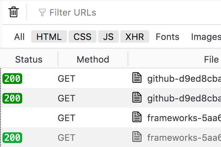
A toolbar should be utilised when a series of grouped buttons or controls specific to a panel should appear high in the content hierarchy. A good example would be to house a series of filter controls which changes the global state or content of a panel, as seen in the Network Panel sub-toolbar.
Types
Main toolbar
The main “toolbox” toolbar which spans the width of Developer Tools Window.
Sub-toolbar
Subheader toolbars are specific to individual panels, a good example is the Network Panel toolbar which houses filter tools and viewing options, tools specific to the Network Panel.
Structure
Toolbars are used as containers for other elements, as such their structure can vary greatly. There are however some common patterns which should be acknowledged for improved consistency among existing implementations.
Control grouping
Buttons or controls which provide primary functions should be grouped and left aligned within the toolbar. Controls which provide secondary or ancillary functionality should be grouped and right aligned within the toolbar.
This pattern is observed in the Main toolbar, the Console and the Debugger Breakpoint toolbar.
Search and filter input
The placement of a search or filter input can vary within a toolbar depending on its perceived priority. As a rule of thumb, the more objective critical an input field is to a panel, the more it should appear toward the left of the toolbar.
Input fields which provide more ancillary functionality should appear right aligned.
Close button.
Remaining consistent with well established patterns, the button used to close a panel should be represented by a cross “X” icon and appear as the rightmost button in the toolbar.
Clear and delete functions
If the toolbar is to contain a control which clears the content of a panel (typically a list of entries), the control should be a button represented by the “classic steel bin” icon and should appear as the leftmost button in the toolbar.
Styles
Toolbar Button Color
Background: transparent, inherits toolbar background (Grey 10 #f9f9fa)
Icon: Grey 90 #0c0c0d
Hover
Background: Grey 20 #ededf0
Icon: Grey 90 #0c0c0d
Selected
Background: Grey 20 #ededf0
Icon: Blue 60 #0060df
Background: transparent, inherits toolbar background (Grey 90 #0c0c0d)
Icon: Grey 40 #b1b1b3
Hover
Background: #252526 Photon color needed
Icon: Grey 40 #b1b1b3
Selected
Background: #252526 Photon color needed
Icon: #75BFFF Photon color needed
Toolbar Tab Color
Background: transparent, inherits toolbar background (Grey 10 #f9f9fa)
Text: Grey 90 #0c0c0d
Icon: Grey 90 #0c0c0d
Hover
Background: Grey 20 #ededf0
Text: Grey 90 #0c0c0d
Icon: Grey 90 #0c0c0d
Tab top border (main toolbar only): rgba(0,0,0,0.2) Photon color needed
Selected
Background: transparent, inherits toolbar background (Grey 90 #0c0c0d)
Text: Blue 60 #0060df
Icon: Blue 50 #0a84ff
Tab top border (main toolbar only): Blue 50 #0a84ff
Background: transparent, inherits toolbar background (Grey 90 #0c0c0d)
Text: Grey 40 #b1b1b3
Icon: Grey 40 #b1b1b3
Hover
Background: #252526 Photon color needed
Text: Grey 40 #b1b1b3
Icon: Grey 40 #b1b1b3
Tab top border (main toolbar only): rgba(255,255,255,0.2) Photon color needed
Selected
Background: transparent, inherits toolbar background (Grey 90 #0c0c0d)
Text: white #ffffff
Icon: white #ffffff
Tab top border (main toolbar only): Blue 50 #0a84ff
Sizes

Main toolbar
Height: 29px
Text: 12px, regular 400
Icons
Width: 16px
Height: 16px

Sub-toolbar
Height: 24px
Text: 11px, regular 400
Icons
Width: 16px
Height: 16px
Behaviours
Toolbars can contain a variety of different elements, these include but are not limited to:
- Buttons Often acting as tabs to alter the view of the window.
- Separators Typically a simple line which provides a method of separating groups of controls.
- Icons SVGs which typically appear within a button element to illustrate the button action.
- Form controls Checkboxes and input fields for filtering and customising the current view.
Resizing
When the parent panel of a toolbar is resized to a width that is smaller than the natural width of the toolbar’s combined child elements, an overflow button appears which provides menu (doorhanger) access to the elements which are no longer visible.
The double-chevron button is removed if the width of the parent panel is increased to allow for all of the toolbar menu items to appear in a single row.