Doorhangers
 This is a working draft
Report issue
This is a working draft
Report issue
Doorhangers provide a way to present decisions to users which is less intrusive than a modal dialog.
Usage
Doorhangers are used for prompt and notification; they are used for full featured UI; or they are used for list and menu as in the example on the left.
Structure
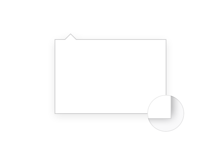
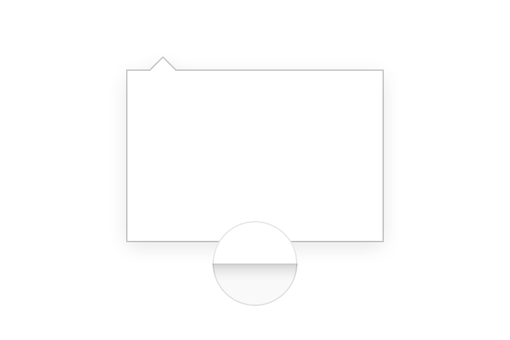
Directional Arrow

Doorhangers opening on the right side of the view show the directional arrow on the right.
Doorhangers opening on the left side of the view show the directional arrow on the left.
Never place the directional arrow at the center of doorhangers.
Style
Background and Border Colors

Background: White #ffffff
Border Color: Grey 90 a20 rgba(12, 12, 13, 0.2)
Corner Radius
On Windows doorhangers have sharp corners.

On macOS and Linux doorhangers have rounded corners.
Corner Radius: 2px
Shadows
Doorhangers appear above other in-view elements. Use shadow 30 to highlight elevation.
Sizes

Directional Arrow Height: 9px
Directional Arrow Margin Left: 16px
Directional Arrow Width: 18px
Maximum Height: 90%
Maximum Width: 320px
Behavior
Clicking outside of the active area dismiss doorhangers.
When doorhangers content is longer than 90% of the view make the content vertically scrollable.