Card
 This is a working draft
Report issue
This is a working draft
Report issue
Card is a component to visually group related information and controls.
Usage

When there are collections of images and components that need to be presented on the same page, use cards to help users quickly scan the information from collections to collections.
Styles
Borders
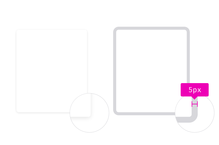
Border radius: 4px
Highlight border: Grey 30 #D7D7DB, 5px (outside)
Shadow

Shadow is optional for cards.
If there’s a need of adding a shadow, use shadow 10 to highlight elevation.
Padding
Use the same padding on the left & right to keep the visual balance.

Default padding: 16px
Large padding: 20px