Checkboxes
A checkbox is used to choose between two opposite states, often to select/deselect items or enable/disable actions.
Toggles provide an alternative UI for the same use cases and are often used on mobile.
Usage
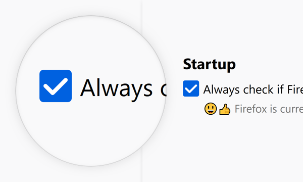
Use checkboxes to provide a binary choice. For example to offer a choice about performing an action or not. It is considered “on” when it is checked, and “off” when it’s not.
Combination
A checkbox can be used as a single element, or it can be combined into a list, or nested list of elements to pick multiple from.
Single

Use one checkbox to offer one binary choice.
Group

Group checkboxes to convey a set of choices are related.
Nested Group

Nest checkboxes to convey that some options are only available if the parent option is selected.
See Nesting for more info on how to nest elements.
Style
A checkbox consists of a part to indicate its state and a label to describe the binary choice it represents.
Indicator & Label

Use the indicator to show whether the checkbox is checked (“on”) or not (“off”).
Use the label to make the action clear and convey that it is a binary choice.
Dimensions

Corner Radius: 2px
Height: 16px
Width: 16px
Horizontal Padding: 4px
Text and Color

Text: Body 10
Text Color: Grey 90 #0c0c0d
Behaviors
On / Off
Checked (On):
Icon: Checkbox-Check
Background Color: Blue 60 #0060df
Unchecked (Off):
Background Color: Grey 90 a10 rgba(12, 12, 13, 0.1)
Border: 1px Grey 90 a30 rgba(12, 12, 13, 0.3)
Clicktarget

A checkbox can be toggled by clicking on the area of its checkbox as well as its label. Usually the clicktarget extends to the same width for each element in a collection of checkboxes. This results in a click target that extends beyond the label, for all elements shorter than the longest.
Clicking a checkbox triggers the action on release of the click. If, during the click, the mouse is moved off of the checkbox, no action is triggered.
Disabled

40% Opacity
Can not be interacted with nor focused.
Interaction
Checked
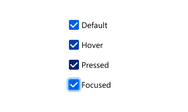
Background Color:
Default: Blue 60 #0060df
Hover: Blue 70 #003eaa
Pressed: Blue 80 #002275
Focused:
Border: none
Box Shadow: 0 0 0 1px #0a84ff inset, 0 0 0 1px #0a84ff, 0 0 0 4px rgba(10, 132, 255, 0.3)
Unchecked
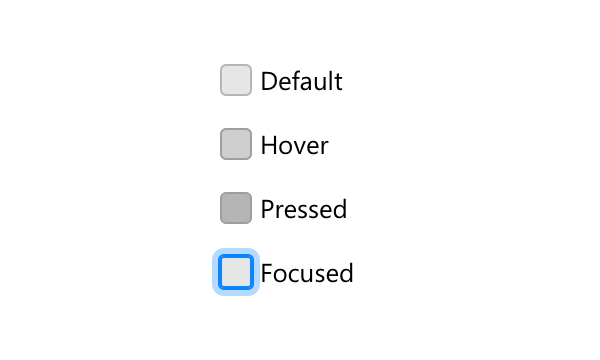
Background Color:
Default: Grey 90 a10 rgba(12, 12, 13, 0.1)
Hover: Grey 90 a20 rgba(12, 12, 13, 0.2)
Pressed: Grey 90 a30 rgba(12, 12, 13, 0.3)
Focused:
Border: none
Box Shadow: 0 0 0 1px #0a84ff inset, 0 0 0 1px #0a84ff, 0 0 0 4px rgba(10, 132, 255, 0.3)
Copy Rules
-
Use the imperative voice for checkbox labels.
-
Do not use terminal punctuation for checkbox labels.
-
Maintain parallel construction for lists of related checkbox labels.