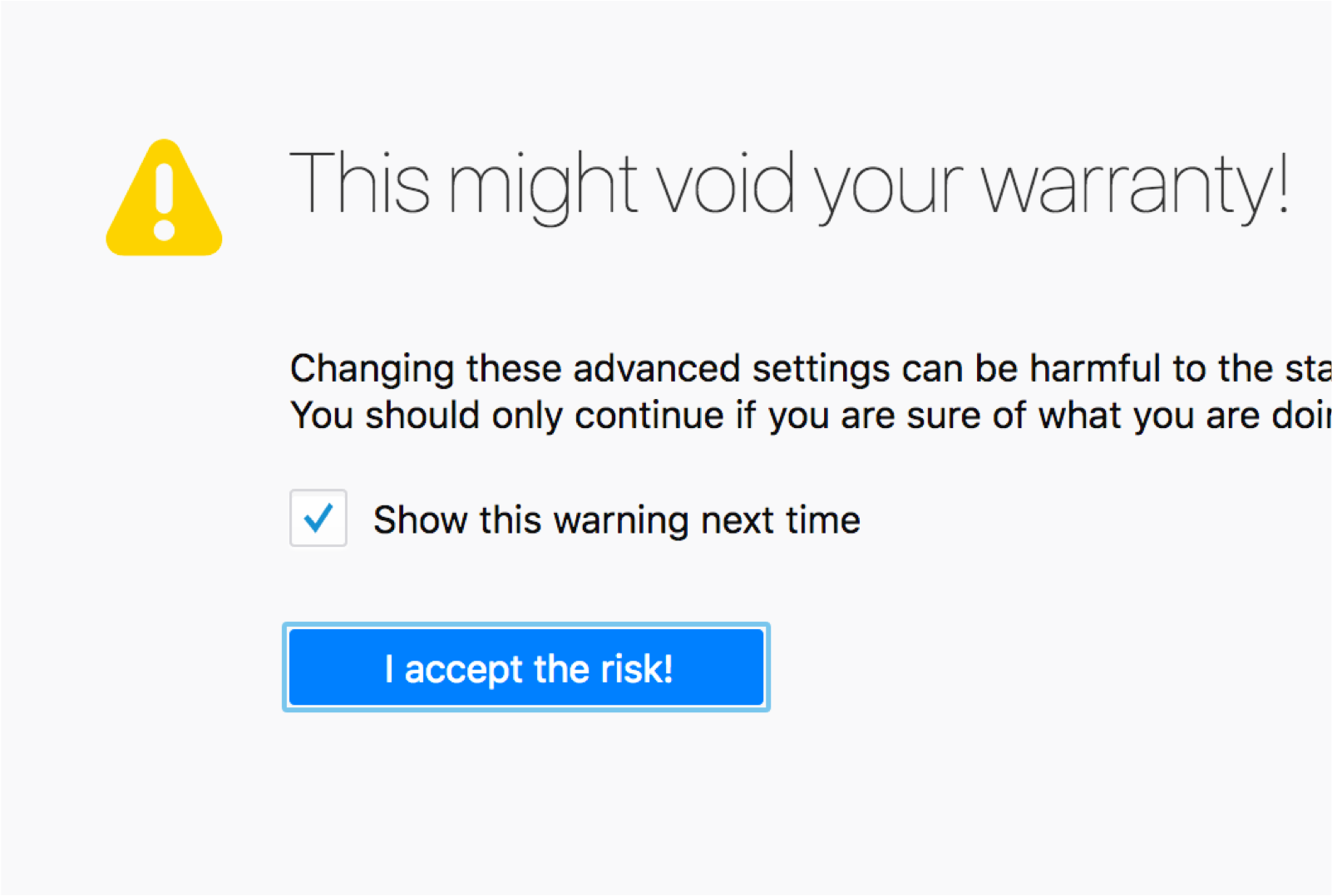
Warnings
Usage
Warnings alert users prior to actions that may be damaging or harmful, without restricting them from taking an action. Warnings are generally used for issues that occur because of external factors (e.g., arriving at a dangerous website, or using a site that is causing Firefox to slow down) and should be used sparingly as part of a planned interaction. (It is ok to ask users to confirm decisions, but those confirmations should usually not take the form of a warning.)
Warnings support users with the content of the messages (text, icons, color) as well as the context (where on the screen and when in the user flow the messages appear).
We distinguish between two different categories of warnings:
- Generic warnings
- High visibility warnings
Generic warnings
Generic warnings are an early indicator of trouble.
Generic errors the most common in Firefox. They can use a combination of icon and background, or simply the icon.


High visibility warnings
High visibility warnings are an early indicator for an action which has significant consequences or it cannot be easily undone.
Those kind of warnings are extremely rare. They can use a combination of icon and background, or simply the icon. They use the red color to underline the urgency and the sense of emergency.

Style
Icon
The icon used to indicate errors is an exclamation mark enclosed within a triangle.
Color
Yellow is the dedicated color for warning states. Warning text should be highly legible, with noticeable contrast against its background color.
In the rare case of a high visibility warning, use red to indicate the seriousness of the warning.
Copy Rules
A good warning message is immediately pertinent and actionable.
-
Alert users to a situation or possible issue as it arises, even if it doesn’t require immediate action.
-
Include information that will help users prevent an immediate issue and avoid similar issues in the future.
-
Rely on color and iconography to alert users to the fact of the warning, and use the limited text of the warning to explain the issue and available user actions. Avoid using the word warning or caution in the copy. When used correctly, the warning icon is enough to communicate that users should proceed with caution.
